The Limerick brandmark is a bold and confident piece of design which reflects Limerick’s international ambitions and unerring character. Transitioning from deep blue through to bright green, it reflects both the County’s strategic location at the mouth of the River Shannon, flowing to the Atlantic, the iconic verdant landscape of Limerick.
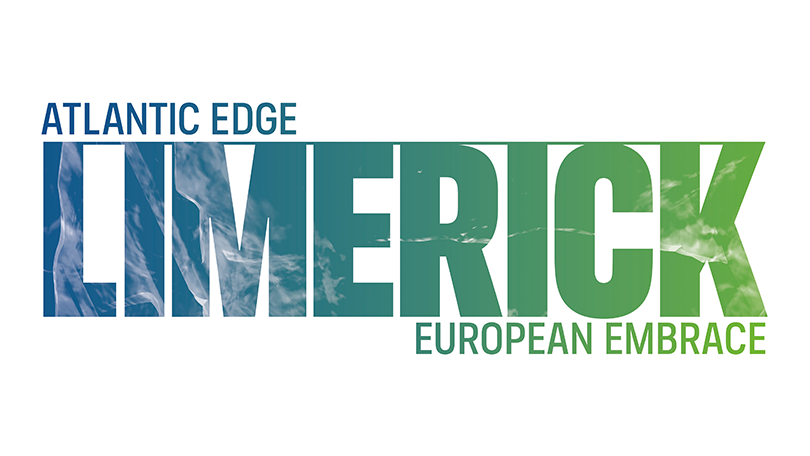
The logo is permeated by a texture derived directly from the Limerick Treaty Stone, using a reproduction technique from Limerick Printmakers. This hardened exterior provides a visual shorthand for the grit, resilience and strength of Limerick.
Limerick’s brandmark embodies these key attributes:
- Modern and characterful
- Rich and multi dimensional
- Embedded with Limerick DNA (the Treaty Stone and LSAD collaboration) - Evoking multiple powerful interpretations (the Shannon, the Atlantic ocean, the sky)
Please always adhere to our Brand Guidelines when using the Limerick logo.
Our logo / colourways
There are two available colourways of the Limerick brandmark. The blue-green gradient version should be used wherever possible, being always placed on top of a white background.
A secondary white version of the brandmark can be used against dark backgrounds and busy images. Ensure the contrast between the background and the logo is sufficient, so legibility is not affected. The black version of the logo should be used in cases where the use of the colour version is not possible, or for accessibility reasons. Note that both colour versions are available in a vector solid version, as well as a textured PSD option. The textured logos are the primary versions of the brand and should only not be used in circumstances where legibility is compromised.
Download our logos
Primary colour version - JPG | PNG | EPS
Primary white version - JPG | PNG | EPS
Primary black version - JPG | PNG | EPS
Secondary colour version - JPG | PNG | EPS